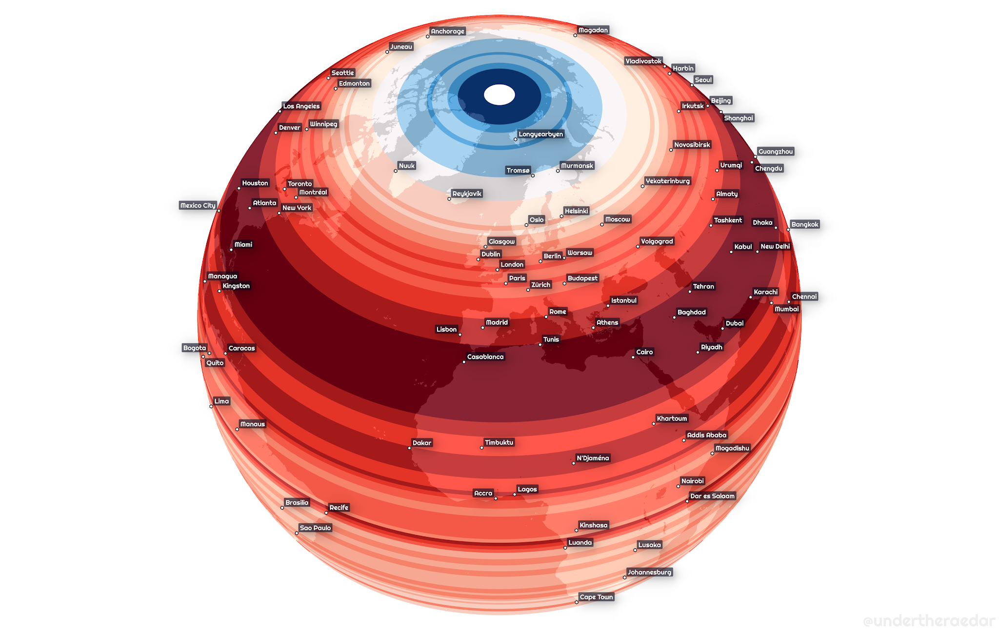
Usually density comparisons are made using cities or countries, but this map from Alasdair Rae provides another perspective. This world map depicts population density by latitude, going from the densest populated coordinates in deep red to the sparsest in light blue.
Find out moe at Visual Capitalist
(Visited 242 times, 5 visits today)